
DOS CROQUETAS
Calle 8, Miami Florida
DOS CROQUETAS
SMALL BITES, BIG FLAVORS
Year
2025
In Miami, croquetas aren’t just snacks — they’re a shared language. A cultural staple passed down through generations. For Dos Croquetas, the city’s first croqueta bar, this deep-rooted tradition became the foundation of a brand with a bold mission: elevate the humble croqueta while keeping it unmistakably local.
Project Category
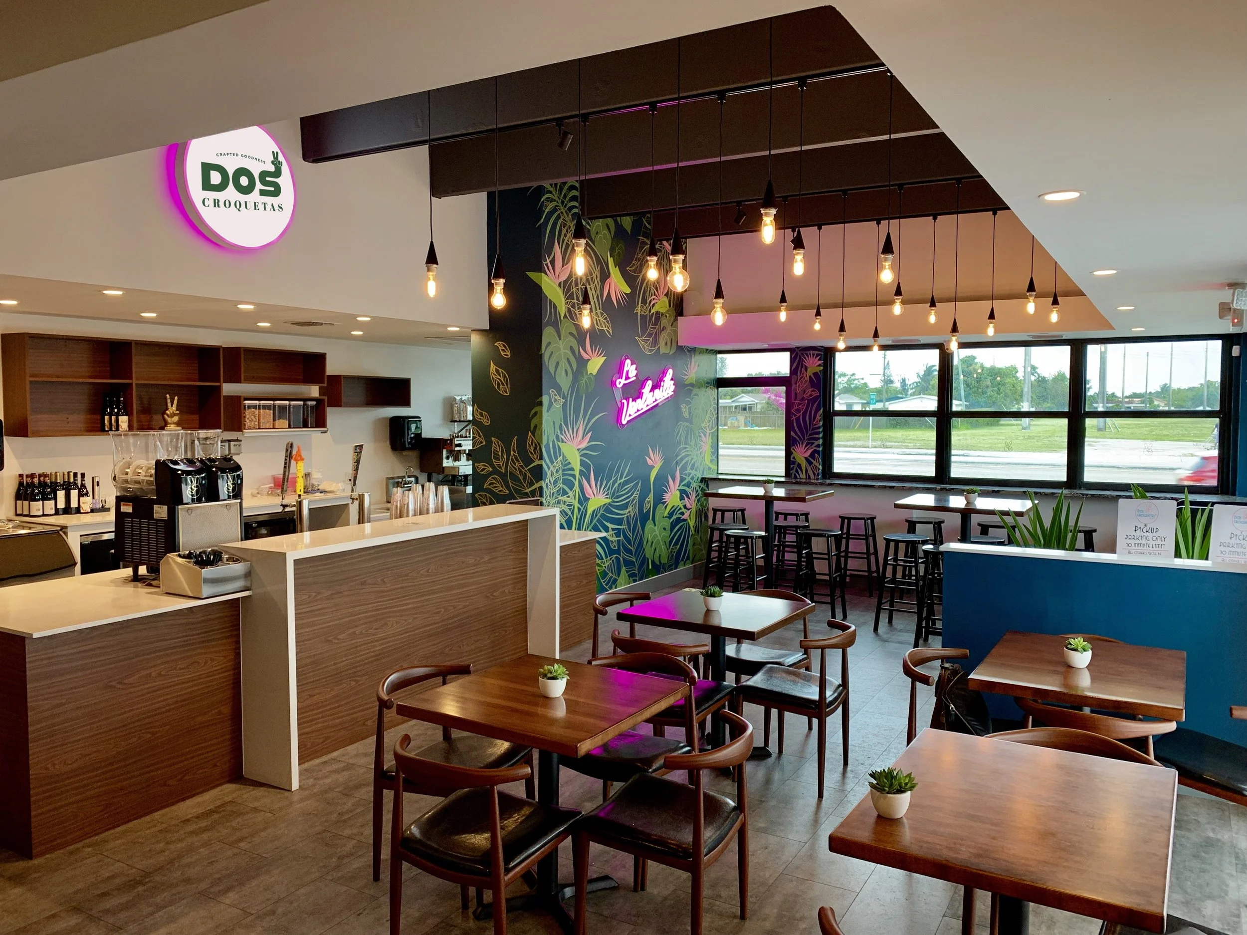
Interior Design / Visual Identity & Branding
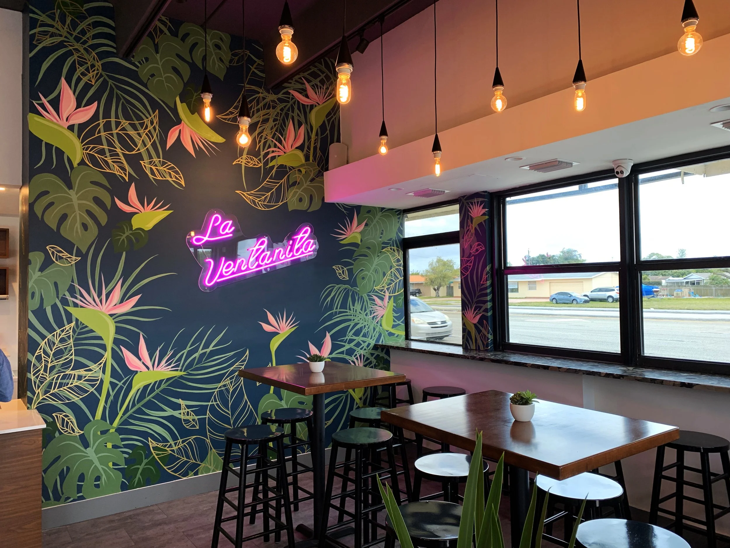
Our work included a comprehensive redesign of the visual identity, packaging systems, menus, signage, and digital presence, each element thoughtfully crafted to reflect the brand’s vibrant energy, creativity, and commitment to flavor innovation.
DESIGN SYSTEMS
DOS CROQUETAS
The brand’s name was never a marketing invention. It came from a real moment — a line at a beloved Cuban ventanita, where someone casually called out, “Dame dos croquetas.” That simple phrase captured everything: identity, memory, rhythm. It became the emotional and cultural heartbeat of the brand.
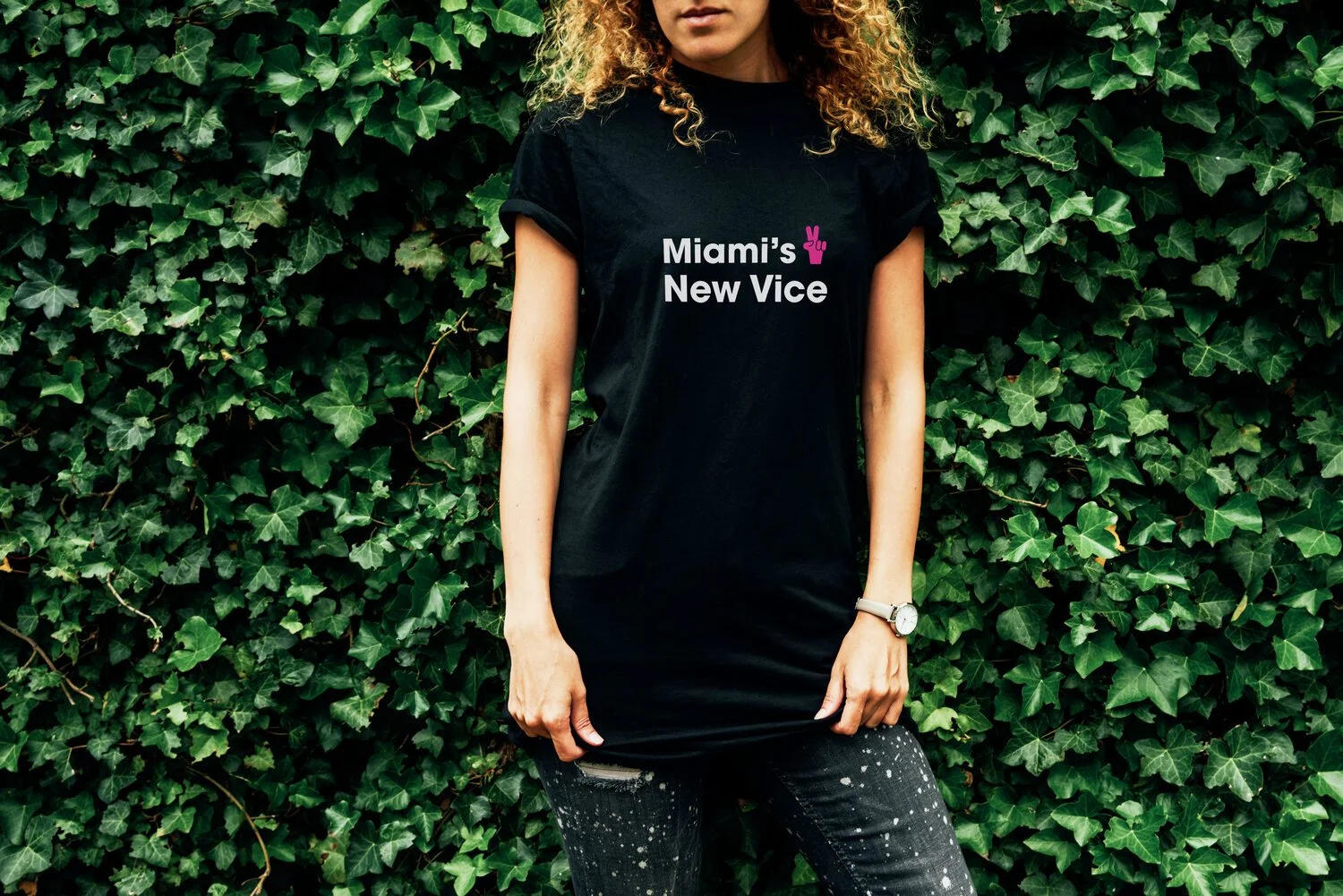
Our task was to carry that feeling into a full brand system — one that resonated as much with a Miami local as with a first-time visitor.
IDENTITY


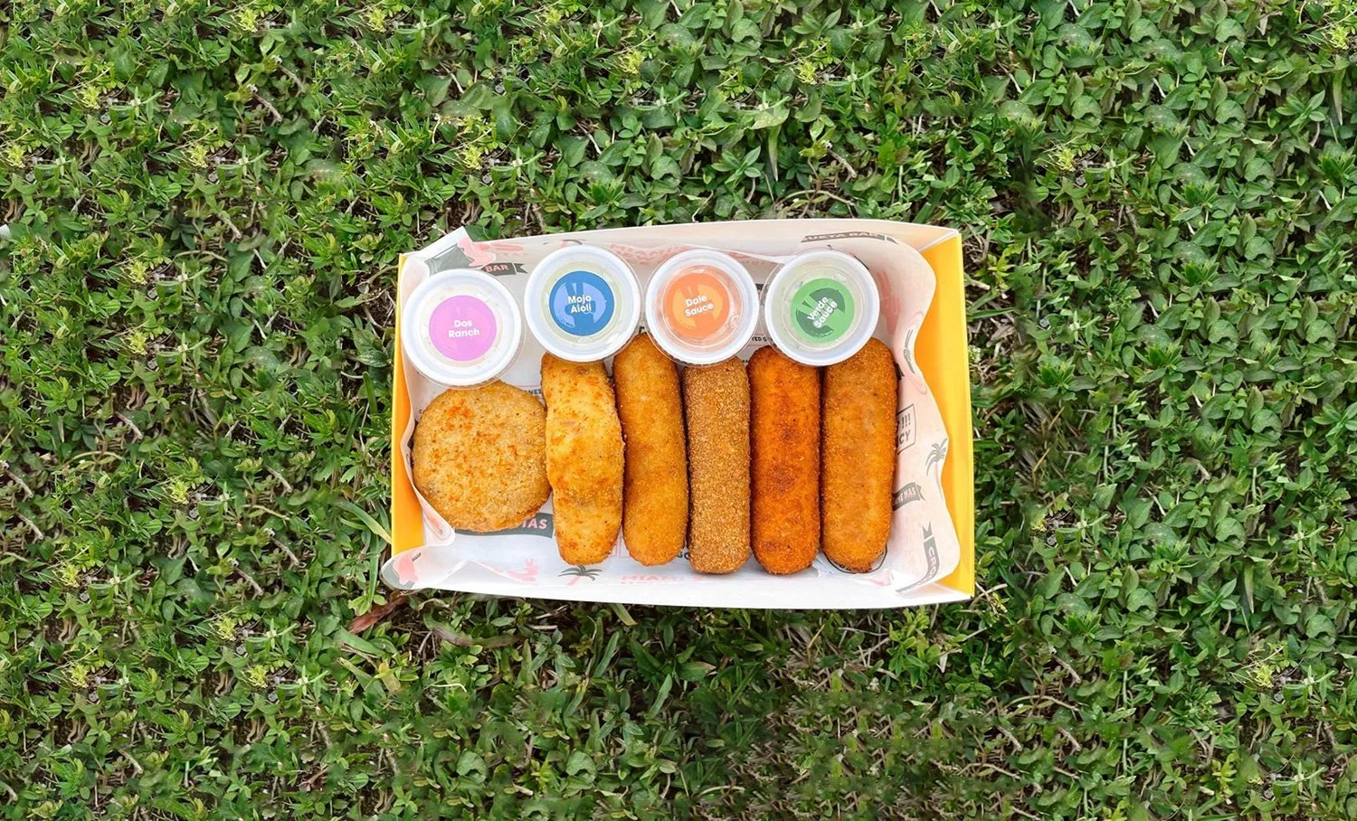
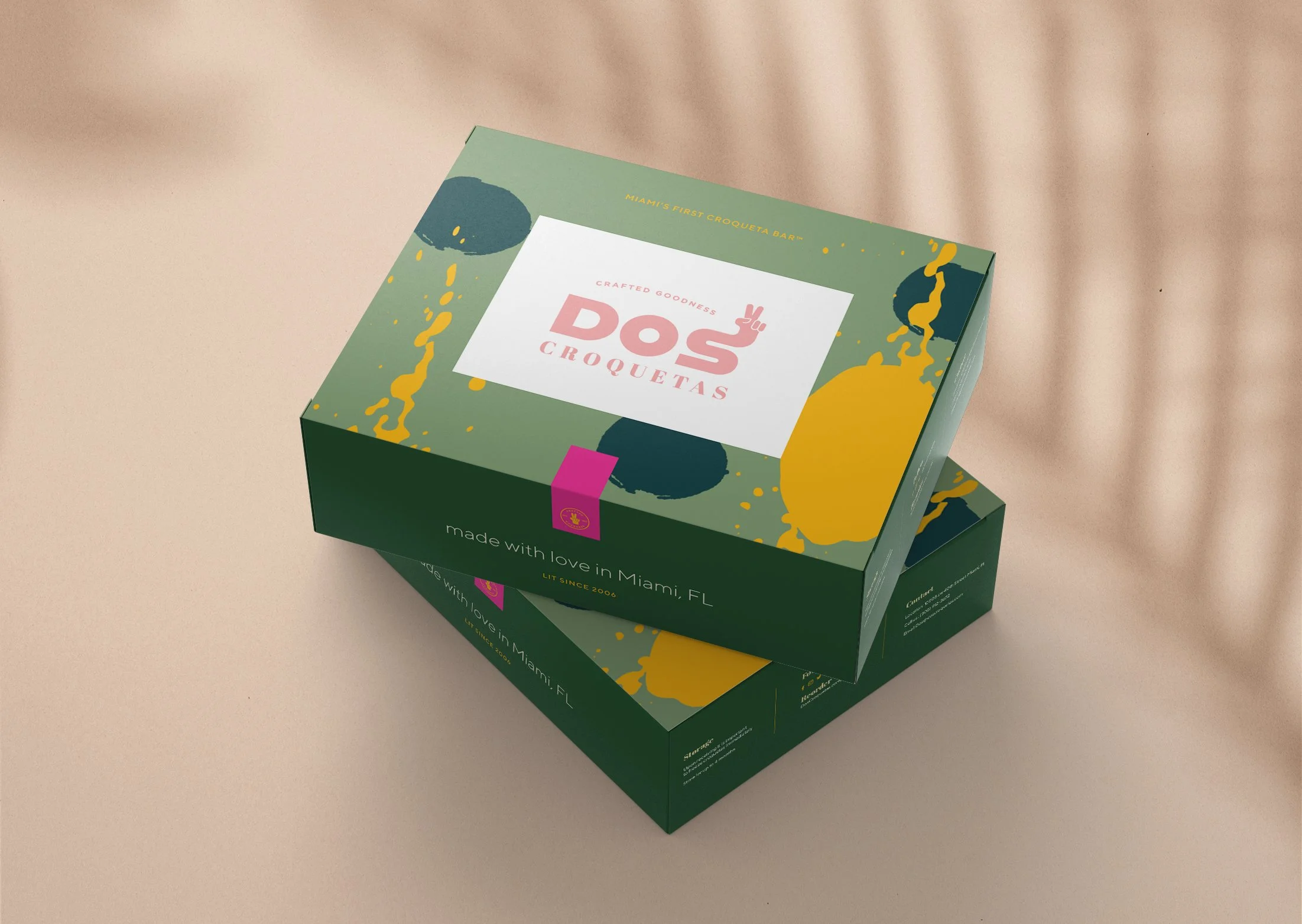
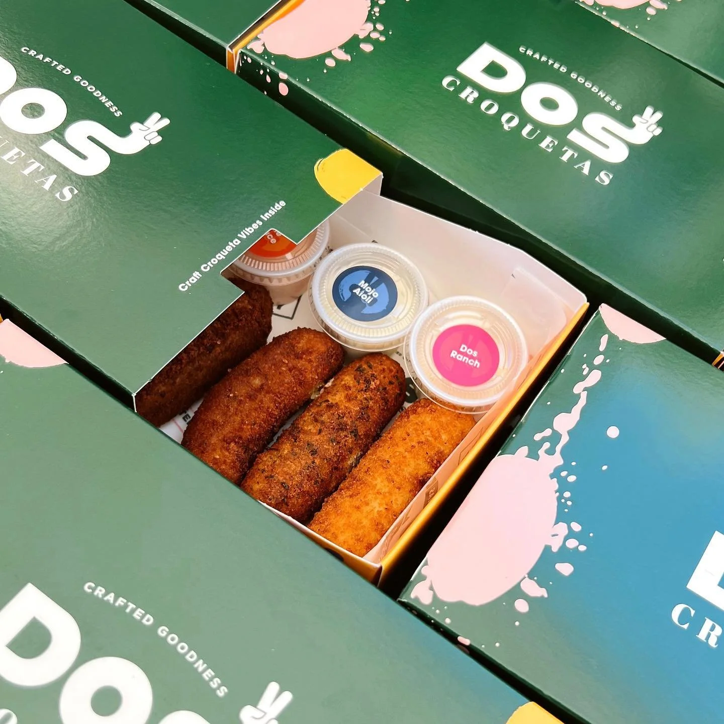
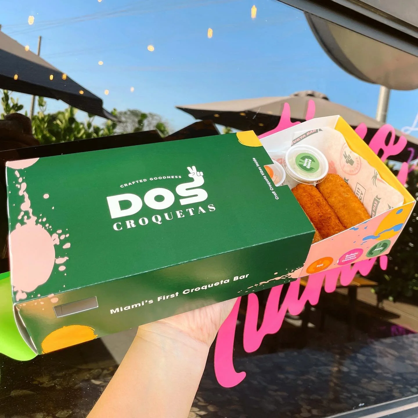
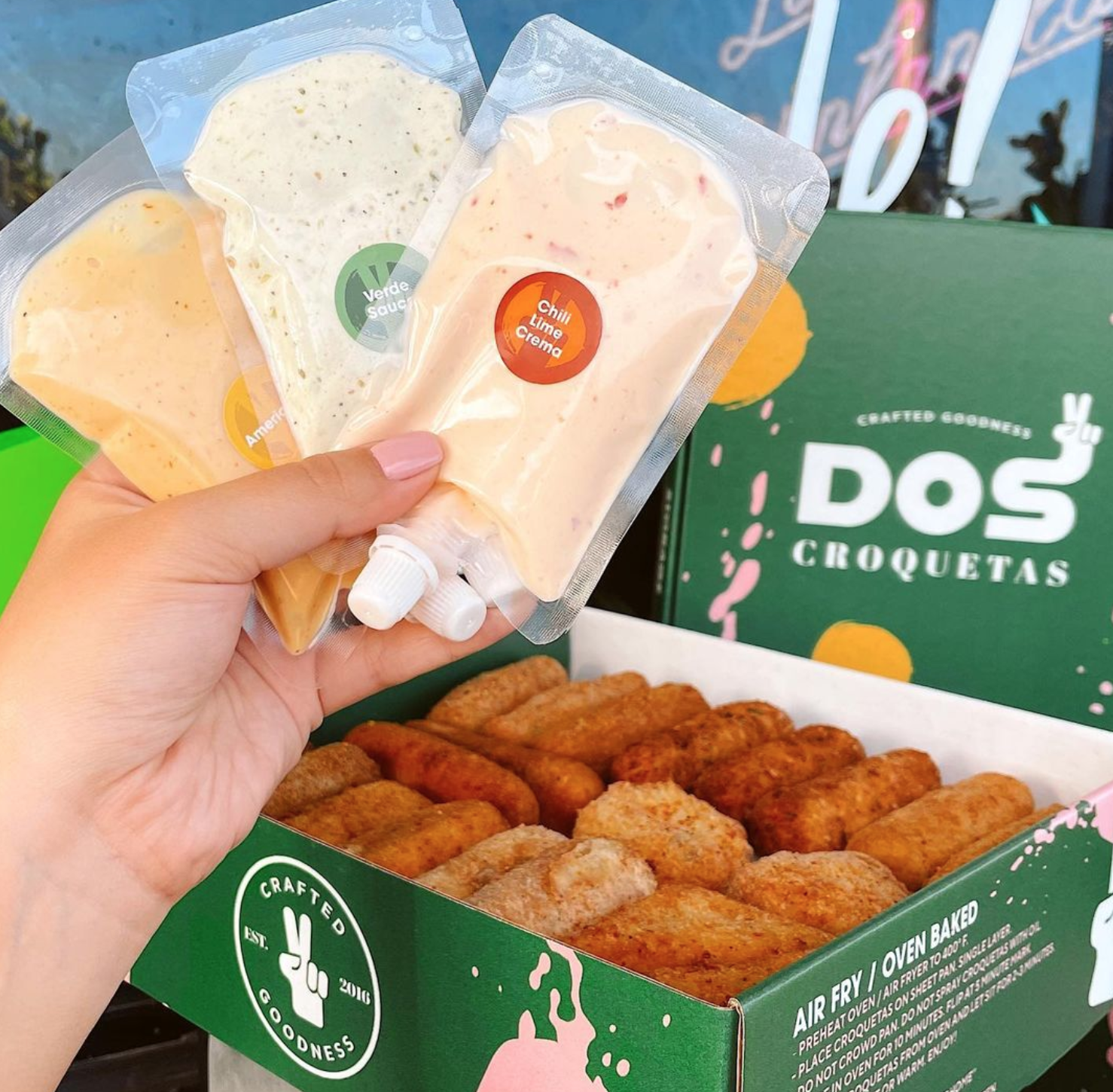
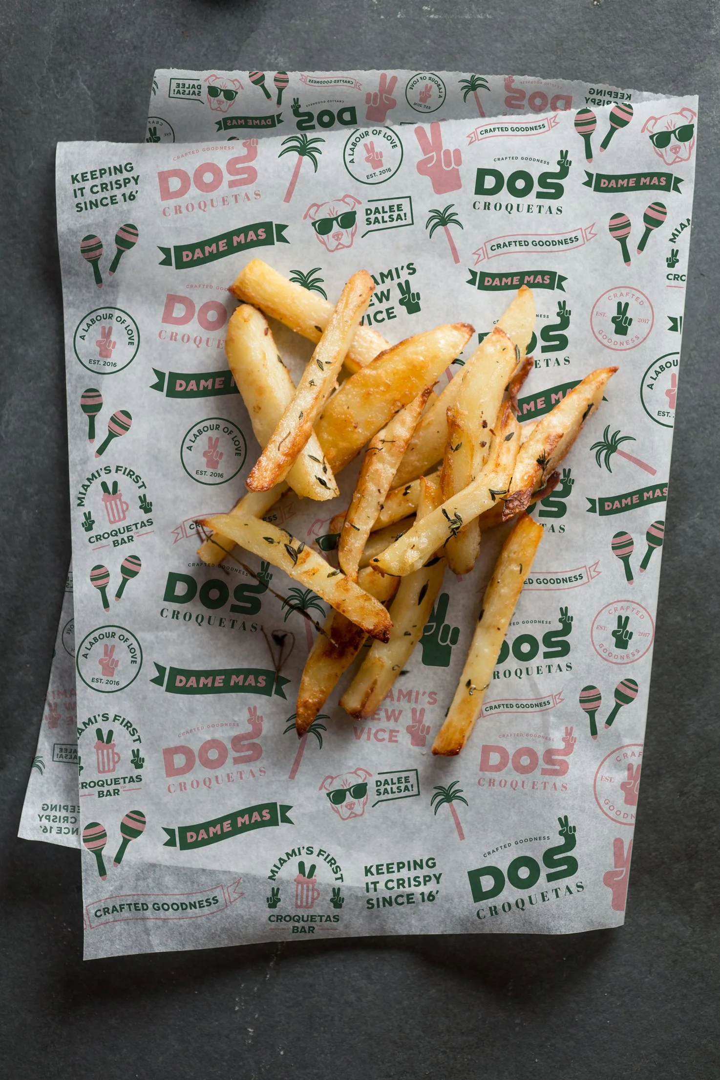
Part of our collaboration focused on the mechanics of how people actually eat croquetas — especially in a fast-casual, takeout-driven environment. We rethought the entire packaging system to support portability, freshness, and brand visibility.
Each croqueta and each sauce now has its own distinct packaging design — maximizing function without losing the visual impact. The result feels personal, craveable, and designed for real life.


JASTOR VALUE
We joined the Dos Croquetas team at a pivotal moment — poised for growth but grounded in personal history. The goal was clear: build a brand that felt fresh, scalable, and design-forward, without losing the authenticity that made it iconic.


DOS CROQUETAS
SOLUTION
The act of dipping a croqueta — slow, intentional, just before the first bite — became a key visual metaphor. We translated that into a design system built around fluid, dripping forms: shapes that recall trails of sauce, bursts of flavor, and the playfulness of eating with your hands.
These elements evolved into patterns, iconography, and brand textures that were applied across touchpoints — Every visual detail was tied to the product, the city, and the experience.
Other Projects

Chiqui Lucky

Propaganda Wynwood

Taima Latin Trap