
Broward County - Orlando, Florida
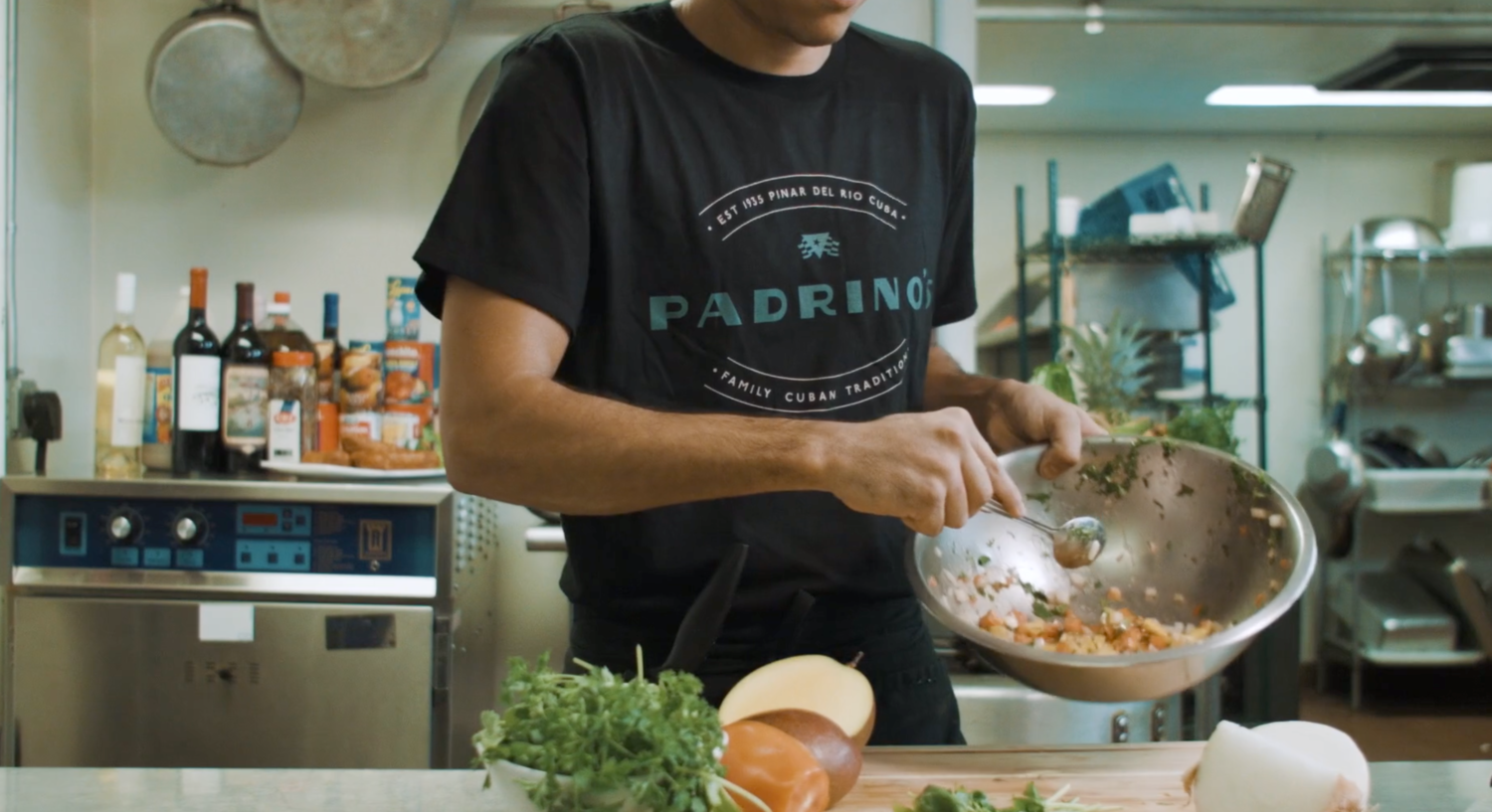
Rebranding Padrino's since 1930 to thrive in the contemporary market, all while honoring the origins of its modest inception in Pinar del Rio, Cuba to Miami in the 1970’s - brand identity, strategy and packaging, “El gusto es nuestro”'


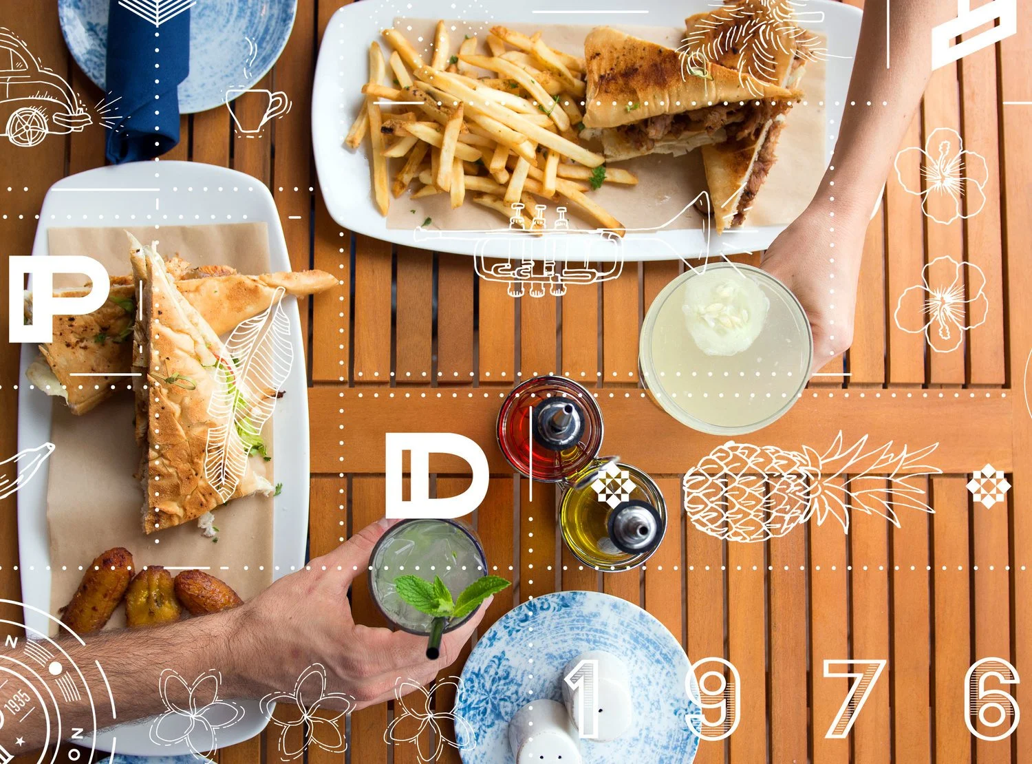
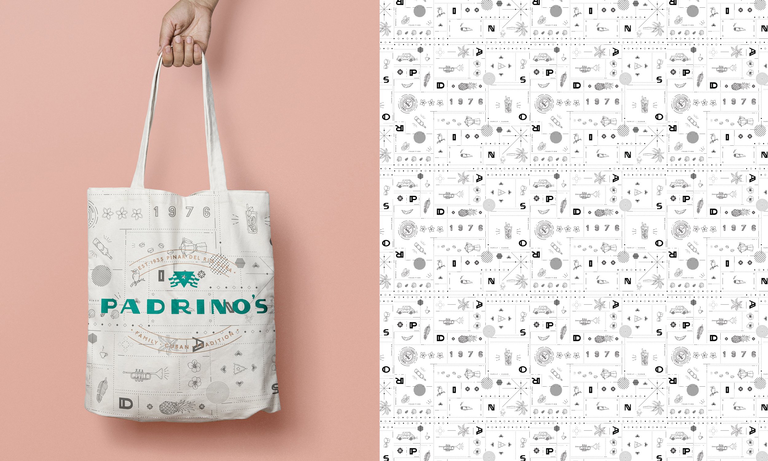
Rooted in family history, Padrino’s narrative inspired us to delve into Cuba's graphic design legacy:
The logo draws from the original 1930 Hermanos Padrino's emblem, infused with a modern twist that echoes Cuban flair. This influence stems from early 20th-century films, cigar boxes, tourism posters, and signage. We modernized these nostalgic elements while retaining their Cuban essence. Hospitality flows in Padrino’s genes, evident in our use of halftone-colored family photographs from Cuba to capture the brand's culture. These evocative images infuse every aspect of Padrino’s identity. Hand-drawn illustrations unique to Padrino’s, alongside resort-style colors and layered ancestral images, form an integral part of the identity.
Services:
Brand strategy
Brand architecture
Visual identity
Marketing
Website
Uniforms
Menu Engineering
Signage
Interior Design Consultancy
Photography
Video
Social Media
-
![Ceviche 105]()
Ceviche 105
-
![Propaganda]()
Propaganda
-
![Sergios]()
Sergios
-
![Novecento]()
Novecento
-
![]()
Yara


